clıent
clıent
soluck
soluck
year
year
2024
2024
servıces
servıces
brand ıdentıty
brand ıdentıty
uı-ux desıgn
uı-ux desıgn
overvıew
overvıew
Blending entertainment with blockchain, SoLuck creates a playful space for users to engage, explore, and connect all within a gamified ecosystem.
Blending entertainment with blockchain, SoLuck creates a playful space for users to engage, explore, and connect all within a gamified ecosystem.
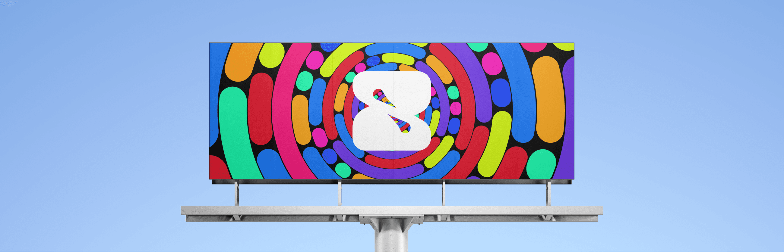
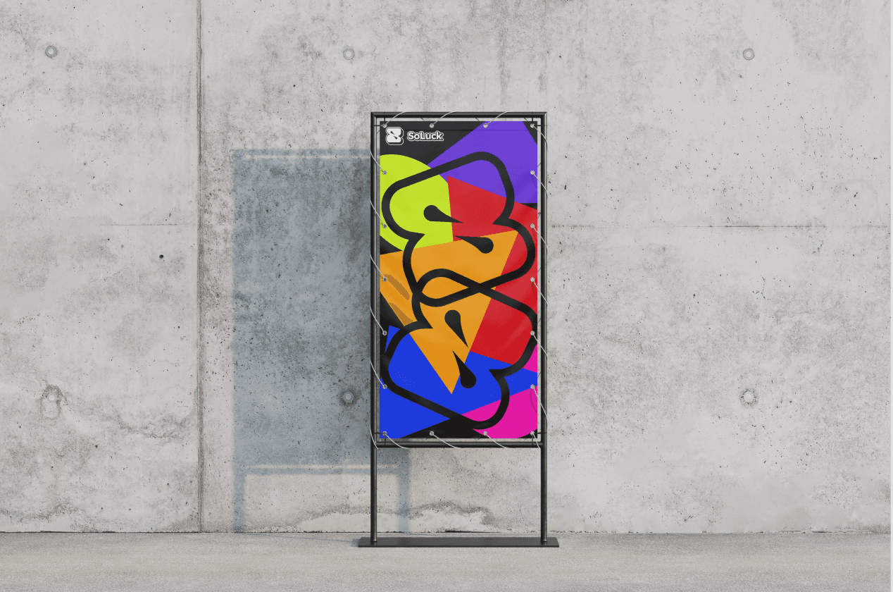
STRATEGY
STRATEGY
Targeting a younger Web3 audience, the visual identity embraces high-energy tones and a sense of fun. The goal was to create an atmosphere that sparks curiosity and excitement, encouraging users to dive into a gamified world that feels both fresh and familiar.
Targeting a younger Web3 audience, the visual identity embraces high-energy tones and a sense of fun. The goal was to create an atmosphere that sparks curiosity and excitement, encouraging users to dive into a gamified world that feels both fresh and familiar.
bro this fonts is giving LinkedIn energy, get it off.
fr fr, we need something that’s like… fun but doesn’t scream Comic Sans.
wait, check out Lexend. lowkey clean but kinda round, yk?
dayyum. lock it in.
bro this fonts is giving LinkedIn energy, get it off.
fr fr, we need something that’s like… fun but doesn’t scream Comic Sans.
wait, check out Lexend. lowkey clean but kinda round, yk?
dayyum. lock it in.
bro this fonts is giving LinkedIn energy, get it off.
fr fr, we need something that’s like… fun but doesn’t scream Comic Sans.
wait, check out Lexend. lowkey clean but kinda round, yk?
dayyum. lock it in.

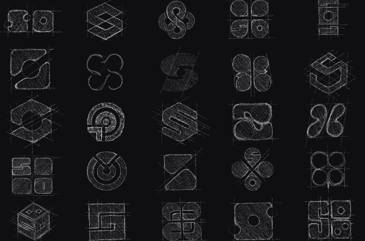
LOGO
LOGO
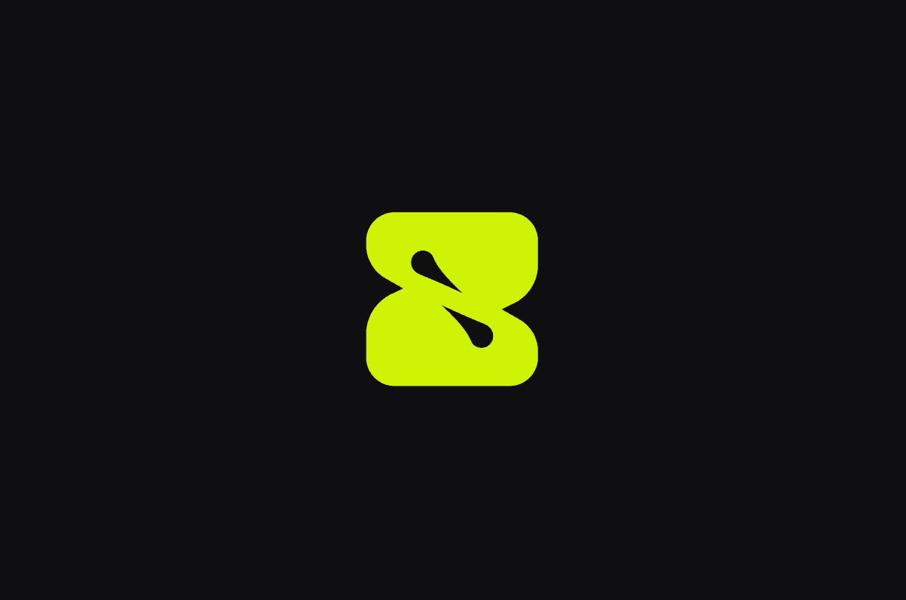
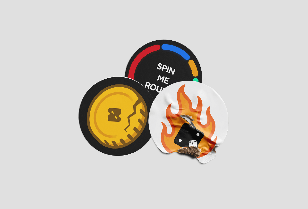
SoLuck logo takes inspiration from the shape of die a timeless symbol of chance and play.
The number 2 was intentionally chosen to evoke a sense of competition and interaction, as most games require at least two players. This subtle reference supports the social and multiplayer nature of the platform.

OTHER WORKS /
EXPLORE SELECTED PROJECTS
OTHER WORKS /
EXPLORE SELECTED PROJECTS
Take a look at our OTHER WORKS.
Take a look at our OTHER WORKS.
SERVICES /
what we do?
SERVICES /
what we do?
A focused set of design and development services
to help brands build, launch, and scale digital products.
A focused set of design and development services to help brands build, launch, and scale digital products.
01
UI - UX DESIGN
01
UI - UX DESIGN
02
BRAND IDENTITY
02
BRAND IDENTITY
03
MOTION DESIGN
03
MOTION DESIGN
04
DEVELOPMENT
04
DEVELOPMENT
05
NO-CODE DEVELOPMENT
05
NO-CODE DEVELOPMENT

London
Unit 501, Leroy House, 434-436 Essex Road, N1 3FY
ıstanbul
İğrip Sokak, Fenerbahçe mah. No: 13 İç Kapı No: 1, 34726
w /
chıck studıo
London
Unit 501, Leroy House, 434-436 Essex Road, N1 3FY
ıstanbul
İğrip Sokak, Fenerbahçe mah. No: 13 İç Kapı No: 1, 34726
w /
chıck studıo
London
Unit 501, Leroy House, 434-436 Essex Road, N1 3FY
ıstanbul
İğrip Sokak, Fenerbahçe mah. No: 13 İç Kapı No: 1, 34726
w /
chıck studıo
w /
chıck studıo
London
Unit 501, Leroy House
434-436 Essex Road, N1 3FY
ıstanbul
İğrip Sokak, Fenerbahçe mah
No: 13 İç Kapı No: 1, 34726